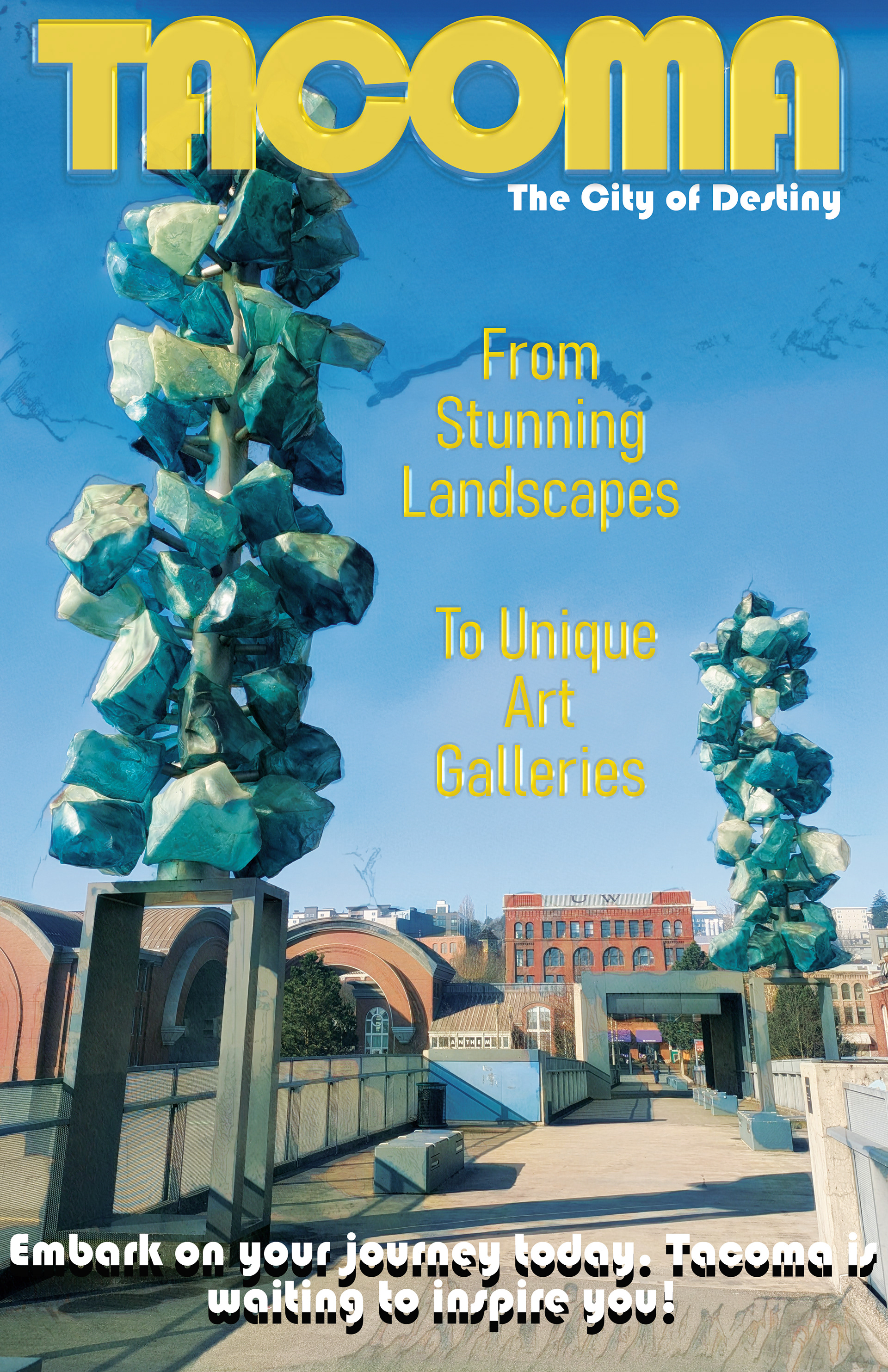

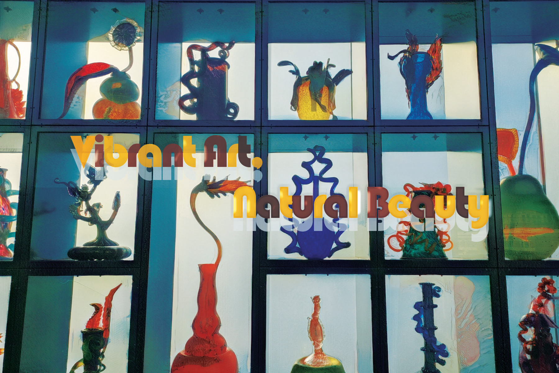
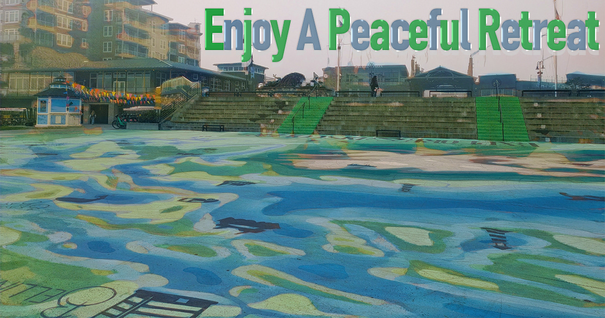
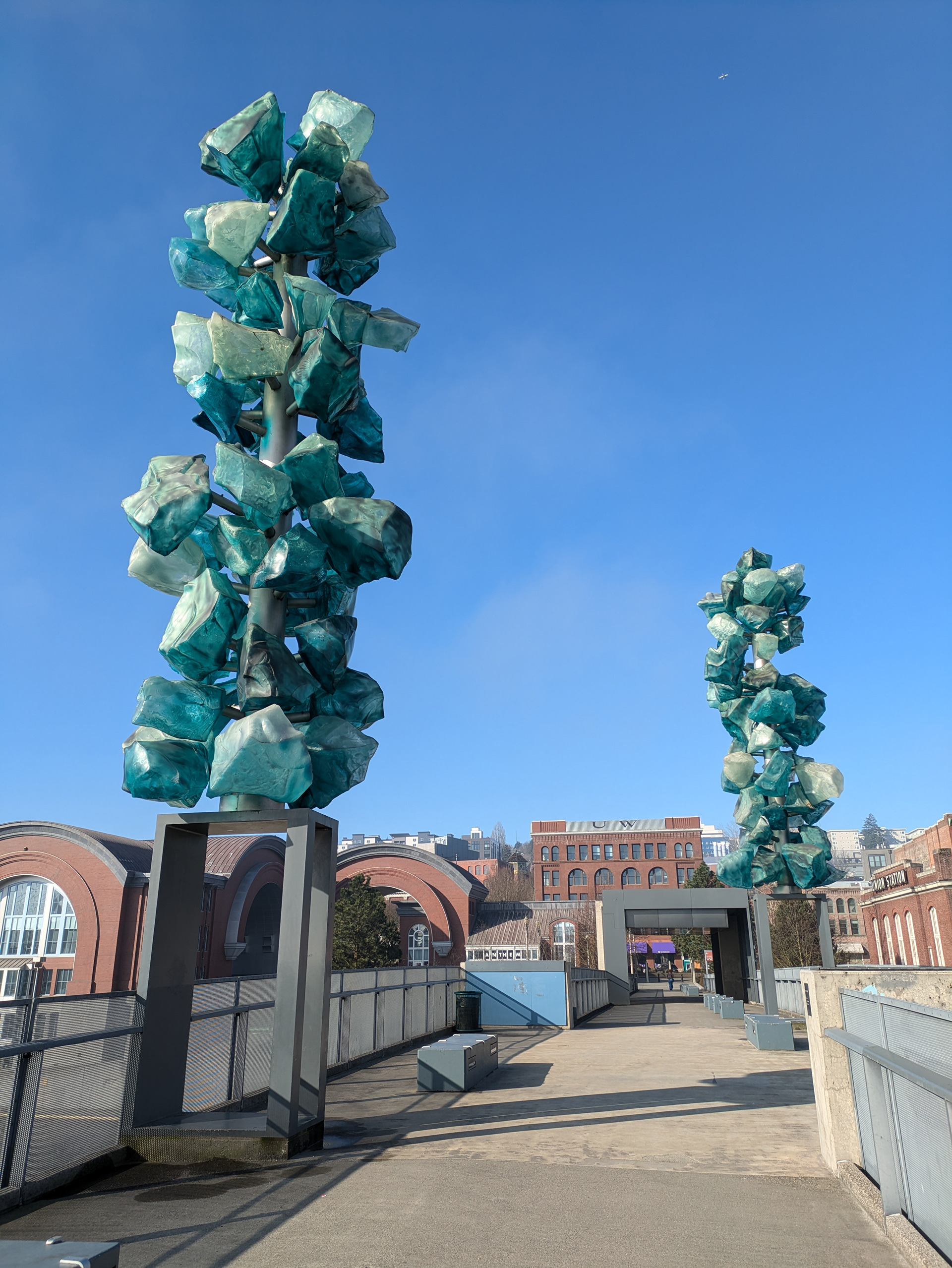
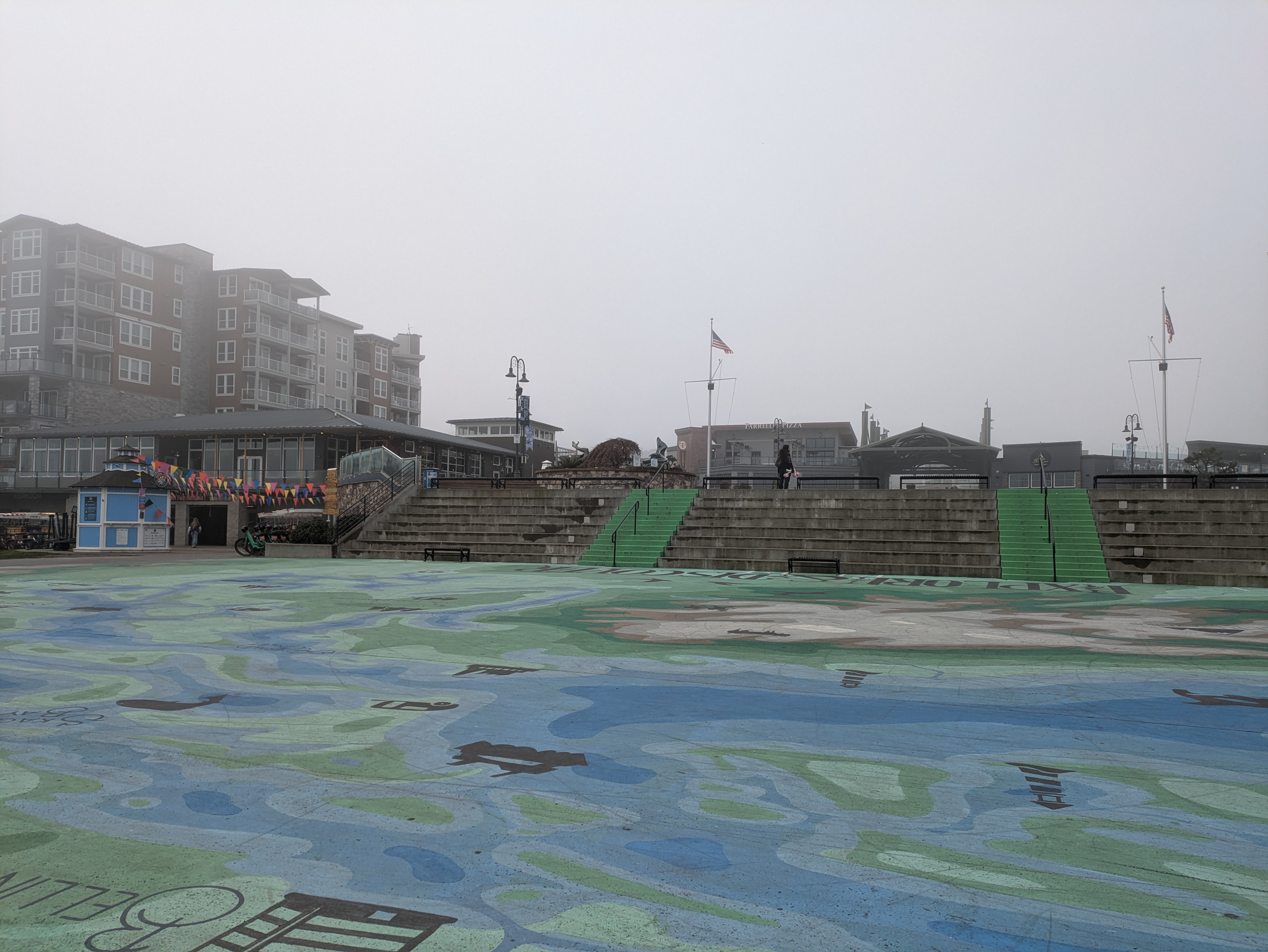
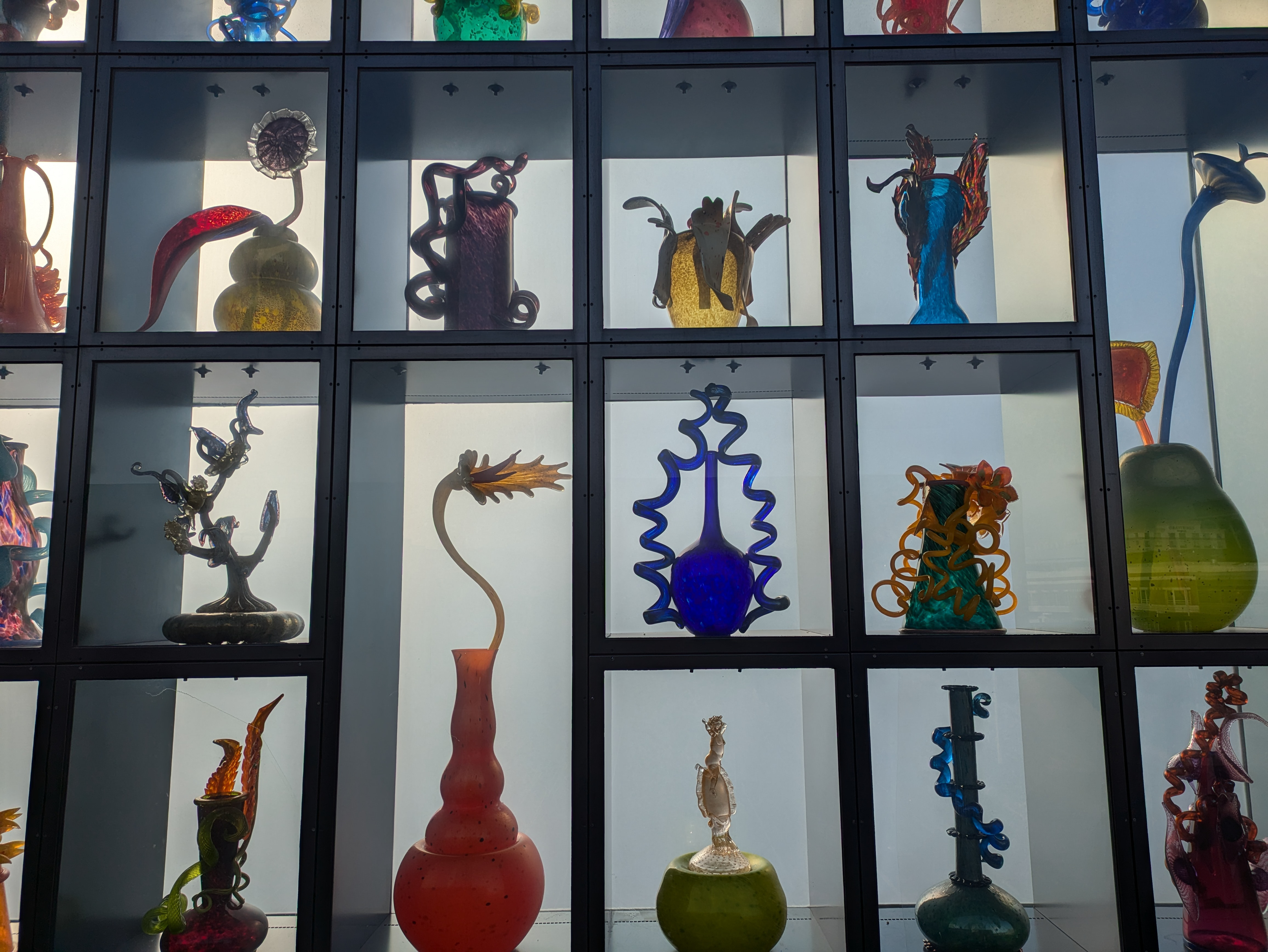
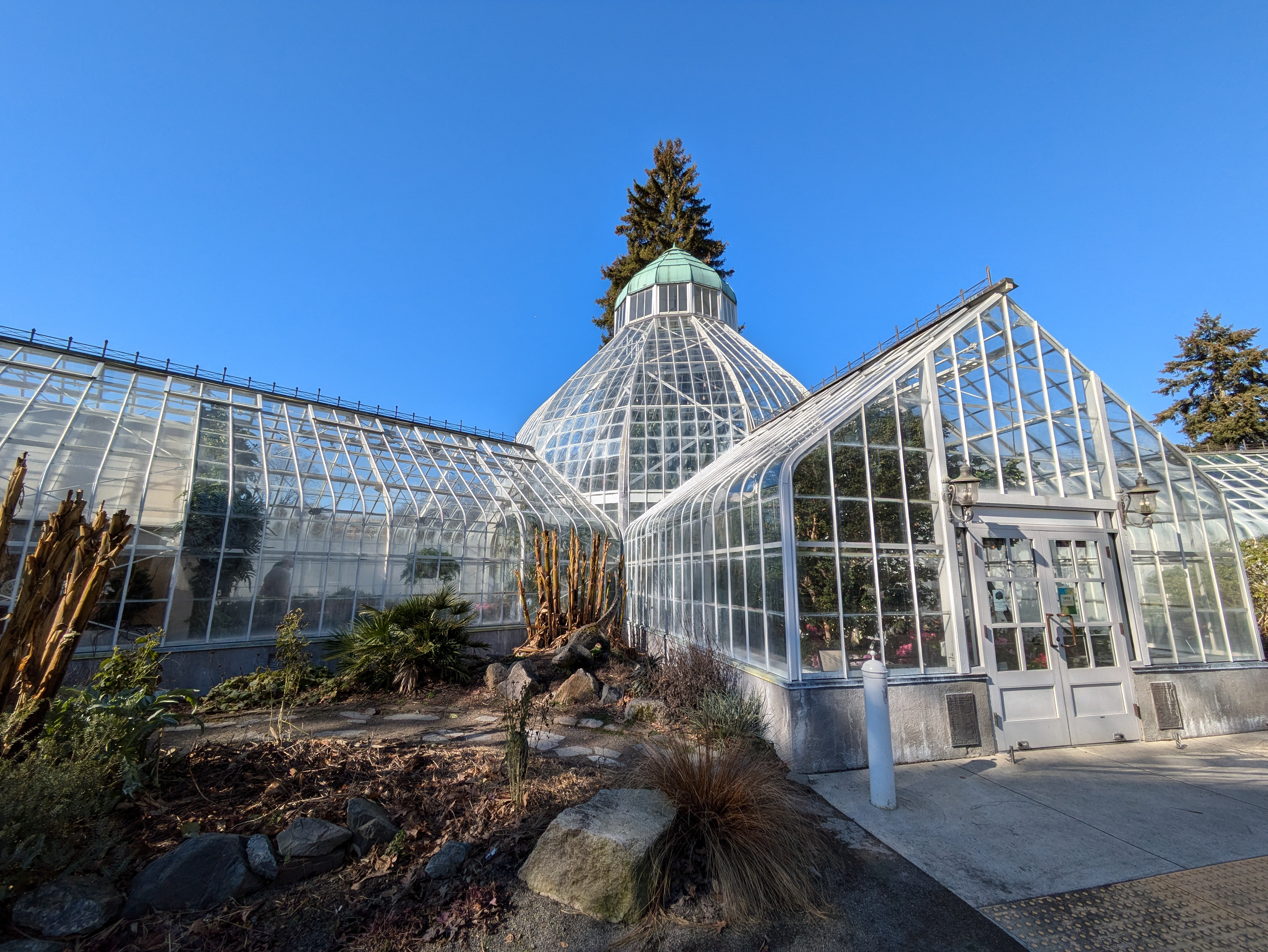
This tourism project sought to highlight the city of Tacoma through its art and natural sites. My main main focus was glass art and vibrant colors so I wanted to mimic this in the fonts that I used and the effects I gave them. I wanted the fonts to be reflective and have a glass-like quality to them. The alternating colors in some of the text were meant to reflect the colorful nature of the glass art. To create a cohesiveness to the project, I focused on using similar colors in the images. I focused on the different hues of green, blue, yellow and red.