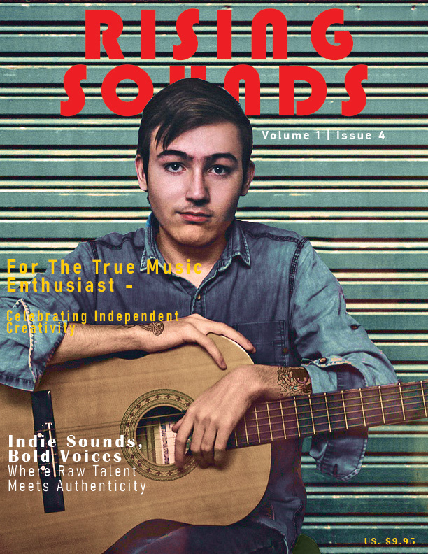

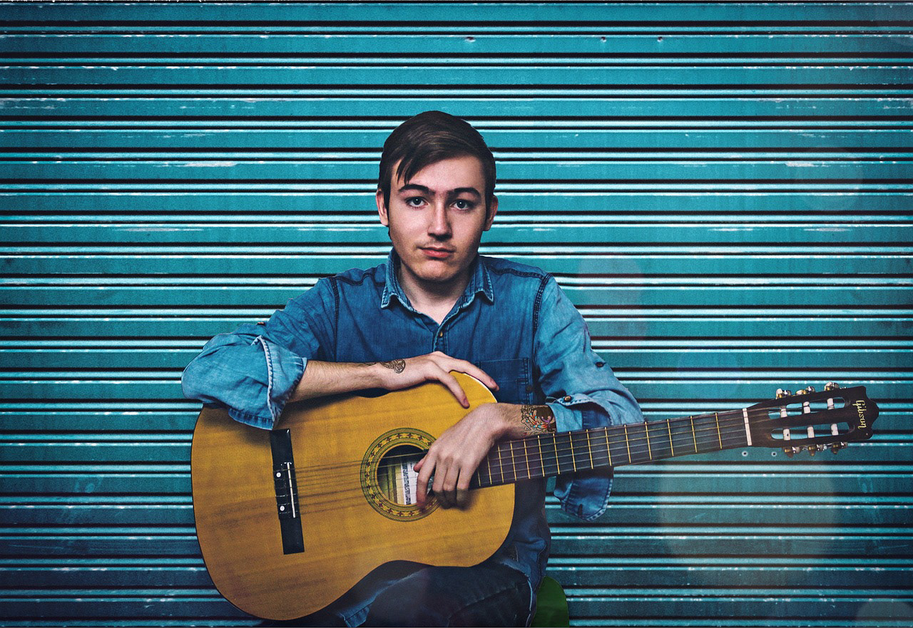

This project was intended to create a magazine cover for new and upcoming artists. Since the artist was meant to be an Indie artist, I used a distressed/faded effect on the image to tone down the blue. I added a more subtle blue overlay on the image and added red font color to contrast. Since the objects and the subject in the image had more of a round shape, I mimicked this in the shape of the font that I selected for the magazine name.